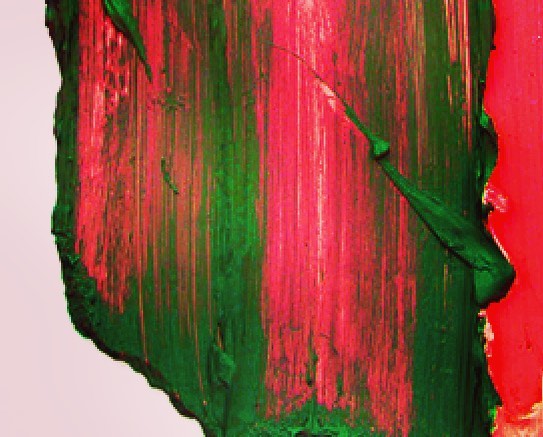
The common use of red-and-green during this holiday season has roots that go back to the ornately-decorated churches of medieval Europe as far back as the 13th century.
A common architectural element in these churches was something called the rood screen. The rood screen divided the nave where the congregation gathered (the profane space) from the chancel where the clergy sat (the sacred space). Red and green featured prominently in many of these screens. Red pigment was made from iron, while the green pigment came from copper. During medieval times these metals were associated with planets—Mars (god of war-red) and Venus (goddess of love-green). Pairing these colors set up the idea of duality: male and female, love and war, etc.
What a positive symbol for this time and in my opinion a wonderful way to approach this holiday accepting that our universe is filled with duality. Let’s listen to people with different ideas, opposing views, and remain open to strangers, and maintain a healthy curiosity for what makes us uncomfortable and challenges us.
Yurok, 2016
Yurok, 2016 (Polymer and pigment on aluminum), 33 × 46 in; 83.8 × 116.8 cm


